By Marianne Bongcac
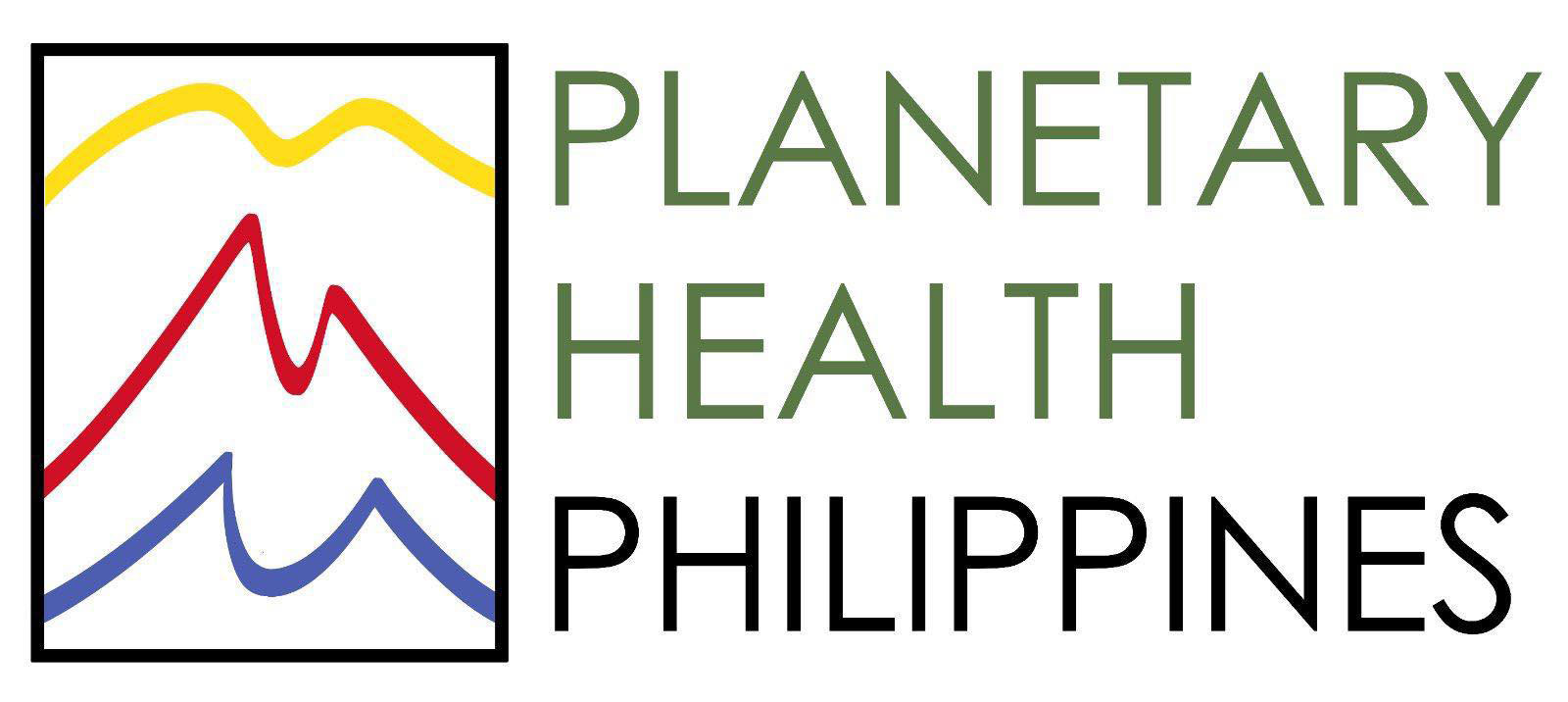
A simple composition with what looks like three lifelines with the colors yellow, red, and blue, mindfully spaced within a rectangular frame – this is the logo of Planetary Health Philippines. But what is the story behind the logo?
PH2 had a chance to chat with the young leader and artist behind the logo – Jake Zimoun Ramos, a registered nurse by profession who is currently taking up a master’s degree in environment and natural resources management at the University of the Philippines Open University. He decided to pursue formal education on environmental management out of his passion for serving the country and protecting the environment – combining it with his initial mission as a nurse, which is to care for people and save lives.
Designing the logo
Jake came up with the logo design when a community invitation was posted on PH2’s Facebook group. Despite not having any prior experience in graphic design, he reached out to one of his colleagues, Lizbeth Perlas, a Philippine registered nurse, now working in the U.S., interested in preserving the environment through modern science. With the use of Jake’s drawing skills and basic knowledge of using a graphic editing software, and Lizbeth’s feedback, together, they crafted what is now PH2’s logo.


“After explaining the task at hand, we decided to create a minimalistic design that would suit the organization. We drew inspiration from several logo designs of other environmental groups. We also tried to pick symbols that best represent the Philippines,” Jake shared via email.
“A few ideas that came to mind were the Philippine Eagle, the Anahaw leaves, and the national flag. Together, we brainstormed through several doodles, trying to fit in symbolism and meaning into a minimalist design. In the end, we decided that we wanted a bird to be included in the logo,” Jake explained.
The initial rendition was composed of two birds flying above the sea’s horizon, a classic view constantly appreciated in an archipelagic country like the Philippines. However, this wasn’t enough for Jake.

“However, as I studied the design, I thought that perhaps the second line could resemble mountains found in the archipelago. Also, to incorporate more of the Filipino aesthetic, we decided to utilize the flag colors: yellow, red, blue, and white, and the result was stunning.”
Discovering PH2
“In our Biodiversity Conservation subject, we were tasked to research how the COVID-19 pandemic is related to biodiversity. In one of my readings for this assignment, I came across the term “planetary health” and became intrigued by the concept,” he shared. He eventually ended up searching for this “ideology” in the country, as he was fascinated by its unique and powerful message.
“Luckily, UPOU posted an announcement on its Facebook page about an online talk on planetary health by Dr. Renzo Guinto. The talk eventually led me to inquire about organizations that focus on planetary health here in the Philippines. That is when I learned that Dr. Guinto is starting one. I ended up joining PH2 to expand my knowledge on the integration of health and the environment and how I could contribute to Filipino society and the broader world.”
A Harmonious Relationship
Asked on what he thinks is the main message of his logo design, Jake gave this reflection:
“As a nurse myself, I thought that the lines also resembled an ECG tracing on a heart monitor, which I love because the logo’s versatility could somehow show its health aspect. To summarize, the logo shows the abundant biodiversity of the Philippines and, at its core, encases the harmonious relationship between human health and the environment.

0 Comments